- Справка Scilab
- Графики
- 2d_plot
- champ
- champ1
- champ properties
- comet
- contour2d
- contour2di
- contour2dm
- contourf
- errbar
- fchamp
- fec
- fec properties
- fgrayplot
- fplot2d
- grayplot
- grayplot properties
- graypolarplot
- histplot
- ВидЛинии
- Matplot
- Matplot1
- Matplot properties
- paramfplot2d
- plot
- plot2d
- plot2d2
- plot2d3
- plot2d4
- polarplot
- scatter
- Sfgrayplot
- Sgrayplot
Please note that the recommended version of Scilab is 2026.1.0. This page might be outdated.
See the recommended documentation of this function
histplot
plot a histogram
Syntax
[cf, ind] = histplot(n, data [,normalization] [,polygon], <opt_args>)
[cf, ind] = histplot(x, data [,normalization] [,polygon], <opt_args>)
Arguments
- n
positive integer (number of classes)
- x
increasing vector defining the classes (
xmay have at least 2 components)- data
vector (data to be analysed)
- normalization
a boolean (%t (default value) or %f)
- polygon
a boolean (%t or %f (default value))
- <opt_args>
This represents a sequence of statements
key1=value1,key2=value2,... wherekey1,key2,...can be any optional plot2d parameter (style,strf,leg, rect,nax, logflag,frameflag, axesflag).- cf
This represents a sequence of statements
key1=value1,key2=value2,... wherekey1,key2,...can be any optional plot2d parameter (style,strf,leg, rect,nax, logflag,frameflag, axesflag).- ind
This represents a sequence of statements
key1=value1,key2=value2,... wherekey1,key2,...can be any optional plot2d parameter (style,strf,leg, rect,nax, logflag,frameflag, axesflag).
Description
This function plots a histogram of the data vector using the
classes x. When the number n of classes is provided
instead of x, the classes are chosen equally spaced and
x(1) = min(data) < x(2) = x(1) + dx < ... < x(n+1) = max(data)
with dx = (x(n+1)-x(1))/n.
The classes are defined by C1 = [x(1), x(2)] and Ci = ( x(i), x(i+1)] for i >= 2.
Noting Nmax the total number of data (Nmax = length(data)) and Ni the number
of data components falling in Ci, the value of the histogram for x in Ci
is equal to Ni/(Nmax (x(i+1)-x(i))) when normalization is true
(default case) and else, simply equal to Ni. When normalization occurs the
histogram verifies:

when x(1)<=min(data) and max(data) <= x(n+1)
Any plot2d (optional) parameter may be provided; for instance to
plot a histogram with the color number 2 (blue if std colormap is used) and
to restrict the plot inside the rectangle [-3,3]x[0,0.5],
you may use histplot(n,data, style=2, rect=[-3,0,3,0.5]).
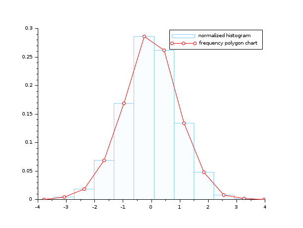
Frequency polygon is a line graph drawn by joining all the midpoints of the top of the bins of a histogram.
Therefore we can use histplot function to plot a polygon frequency chart.
The optional argument polygon connects the midpoint of the top of each bar of a histogram with straight lines.
If polygon=%t we will have a histogram with frequency polygon chart.
Enter the command histplot() to see a demo.
Examples
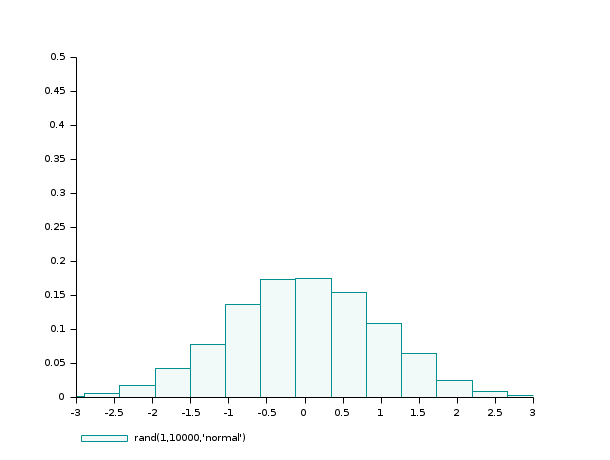
- Example #1: variations around a histogram of a gaussian random sample
d=rand(1,10000,'normal');  // the gaussian random sample
clf(); histplot(20,d)
clf(); histplot(20,d,normalization=%f)
clf(); histplot(20,d,leg='rand(1,10000,''normal'')',style=5)
clf(); histplot(20,d,leg='rand(1,10000,''normal'')',style=16, rect=[-3,0,3,0.5]);
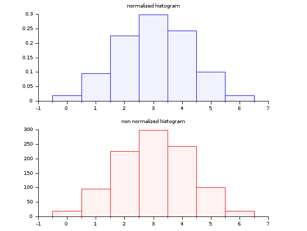
- Example #2: histogram of a binomial (B(6,0.5)) random sample
d = grand(1000,1,"bin", 6, 0.5);
c = linspace(-0.5,6.5,8);
clf()
subplot(2,1,1)
histplot(c, d, style=2)
xtitle("Normalized histogram")
subplot(2,1,2)
histplot(c, d, normalization=%f, style=5)
xtitle("Non normalized histogram")
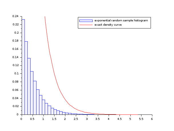
- Example #3: histogram of an exponential random sample
lambda = 2;
X = grand(100000,1,"exp", 1/lambda);
Xmax = max(X);
clf()
histplot(40, X, style=2)
x = linspace(0,max(Xmax),100)';
plot2d(x,lambda*exp(-lambda*x),strf="000",style=5)
legend(["exponential random sample histogram" "exact density curve"]);
- Example #4: the frequency polygon chart and the histogram of a gaussian random sample
n=10;
data=rand(1,1000,"normal");
clf(); histplot(n, data, style=12, polygon=%t);
legend(["normalized histogram" "frequency polygon chart"]);
See also
| Report an issue | ||
| << graypolarplot | 2d_plot | ВидЛинии >> |