multiscaled plots
How to set several axes for one curve or for curves with distinct scales
Description
Several situations may need to use and set several cartesian X axes or several cartesian Y axes, as for instance:
- We want to read the same curve according to distinct scales along
multiple X or Y axes:
If the relationship between both scales is affine (such as y'=a.y+b) and linear axes must be rendered, drawaxis() can be used.
If the relationship between both scales is a power law (such as y'=a.y^b), using logarithmic axes and newaxes() will be required.
gca().tight_limitsproperty will have to be set to "on" in the considered direction We want to overplot several curves sharing the same X abscissae but according to distinct uncorrelated Y scales. Then, one or several overlaying axes will be set using newaxes().
Examples
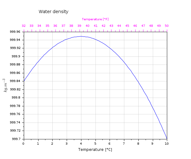
Water density: Two X linear scales for the same curve
t = linspace(0,10,100);
tf = t*1.8+32;
d = -6.863e-3*t.^2 + 0.05463*t + 999.84;
clf
// Main plot
plot(t,d)
xgrid(color("grey70")*[1 1],[1 1], [7 7])
title("Water density","fontsize",3)
xlabel("Temperature [°C]")
ylabel("$kg.m^{-3}$", "fontsize",3)

// Making some space for the 2nd X-label
ax = gca();
ax.margins(3) = 0.2;
ax.title.position(2) = 1000.0;

// Drawing the 2nd temperature axis in °F, + labelling it:
xf = 32:50;
atf = drawaxis(dir='u', tics="v", x=(xf-32)/1.8, y=999.96, val=msprintf("%d\n",xf') )
c = color("magenta");
set(atf, "tics_color",c, "labels_font_color",c)
xstring(5,999.99,"Temperature [°F]")
set(gce(), "clip_state", "off", "text_box_mode", "centered","font_foreground",c);
gcf().axes_size = [610 510];

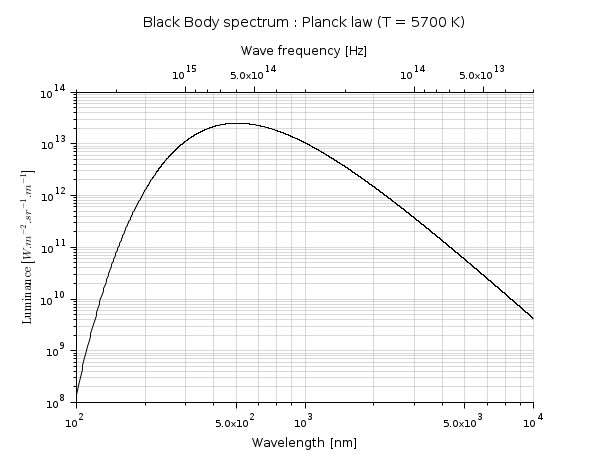
Light spectrum, versus both wavelengths and frequencies: two correlated logarithmic X scales.
function r=Planck(T, lambda)
    h = 6.626e-34;        // Planck constant    [J.s]
    c = 298792458;        // light speed [m/s]
    k = 1.381e-23;        // Boltzmann constant [J/K]
    // stef = 5.670374e-8 // Stefan constant [W/m2/K4]
    r = 2*h*c^2 ./ lambda.^5 ./ (exp(h*c./(lambda*k*T))-1);
endfunction

clf
lambda = (100:10000);
plot2d("ll", lambda, Planck(5700, lambda*1e-9)*1e-6)
xlabel("Wavelength [nm]", "fontsize",2)
ylabel("$\text{Luminance }[W.m^{-2}.sr^{-1}.µm^{-1}]$", "fontsize", 2)
xgrid(color("grey70")*[1 1],[1 1],[7 7])
a1 = gca();
a1.margins(3) = 0.20;
a1.sub_tics(2) = 8;

// 2nd axes, superimposed to the first one
a2 = newaxes();
a2.data_bounds = [3e13,0;3e15 ,1];
a2.Axes_reverse(1) = "on";
a2.axes_visible(1) = "on";
set(a2, "filled", "off", "log_flags","lnn", "x_location","top")
a2.tight_limits(1) = "on";
a2.margins(3) = 0.20;
xlabel("Wave frequency [Hz]", "fontsize",2)
title("Black Body spectrum : Planck law (T = 5700 K)", "fontsize",3)

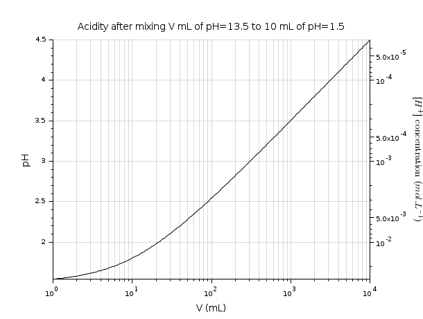
pH: A single curve, with two correlated Y scales: one linear, one logarithmic.
pH1 = 1.5;      // v1 = 10 mL of acid solution
pH2 = 12.5;     // v2 mL of basic solution
v2 = logspace(0,4,200);
// naive raw pH estimation after mixing
pH = -log10((10*(10.^-pH1) + v2*(10.^-pH2))./(10+v2));

clf
plot2d("ln",v2, pH)
ax1 = gca();
ax1.tight_limits(2) = "on";
ax1.sub_ticks(1) = 8;
xgrid(color("grey70")*[1 1],[1 1],[7 7])
title("Acidity after mixing V mL of pH=13.5 to 10 mL of pH=1.5", "fontsize",3)
xlabel("V (mL)", "fontsize",3)
ylabel("pH", "fontsize",3);

// [H^+] logarithmic 2nd scale
ax2 = newaxes();
ax2.data_bounds([4 3]) = 10.^(-ax1.data_bounds([3 4]));
set(ax2, "filled","off", "y_location","right", "log_flags","nln")
ax2.tight_limits(2) = "on";
ax2.axes_visible(2) = "on";
ax2.axes_reverse(2) = "on";
ylabel("$[H^+]\text{ concentration }(mol.L^{-1})$","fontsize",3)
ax2.y_label.font_angle = 90;

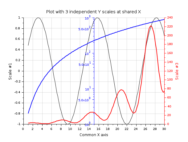
Three overplotted curves sharing the same X axis, with 3 independent Y scales:
// Preparing data
x  = linspace(1,30,200);
y2 = exp(x/6).*(sin(x)+1.5);
y3 = 1+x.^2;

clf

// Black curve => y1 scale (left axis)
y1 = sin(x/2);
plot2d(x, y1)
title(_("Plot with 3 independent Y scales at shared X"), "fontsize",3);
xlabel(_("Common X axis"), "fontsize",2);
ylabel(_("Scale #1"), "fontsize",2);
xgrid(color("grey70")*[1 1], [1 1], [7 7])

// Blue curve => y2 scale (middle axis)
c = color("blue");
ax2 = newaxes();
set(ax2, "filled", "off", "foreground", c, "font_color", c);
plot2d(x, y3, logflag="nl", style=c)
gce().children.thickness = 2;
ax2.axes_visible(1) = "off";
ax2.y_location = "middle";

// Red curve => y3 scale (right axis)
c = color("red");
ax3 = newaxes();
set(ax3, "filled", "off", "foreground", c, "font_color", c);
plot2d(x,y2,style=c);
ylabel(_("Scale #3"),"color",[1 0 0])
gce().children.thickness = 2;
ax3.axes_visible(1) = "off";
ax3.y_location = "right";

| Report an issue | ||
| << pie | Графики | xchange >> |