- Scilabヘルプ
- Graphics
- 2d_plot
- 3d_plot
- annotation
- axes_operations
- axis
- bar_histogram
- Color management
- Datatips
- figure_operations
- geometric_shapes
- handle
- interaction
- lighting
- load_save
- polygon
- property
- text
- transform
- Compound_properties
- GlobalProperty
- Graphics: Getting started
- graphics_entities
- object_editor
- pie
- multiscaled plots
- xchange
- xget
- xset
Please note that the recommended version of Scilab is 2026.1.0. This page might be outdated.
See the recommended documentation of this function
multiscaled plots
How to set several axes for one curve or for curves with distinct scales
Description
Several situations may need to use and set several cartesian X axes or several cartesian Y axes, as for instance:
- We want to read the same curve according to distinct scales along
multiple X or Y axes:
If the relationship between both scales is affine (such as y'=a.y+b) and linear axes must be rendered, drawaxis() can be used.
If the relationship between both scales is a power law (such as y'=a.y^b), using logarithmic axes and newaxes() will be required.
gca().tight_limitsproperty will have to be set to "on" in the considered direction We want to overplot several curves sharing the same X abscissae but according to distinct uncorrelated Y scales. Then, one or several overlaying axes will be set using newaxes().
Examples
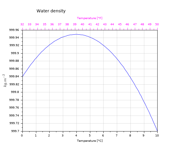
Water density: Two X linear scales for the same curve
t = linspace(0,10,100);
tf = t*1.8+32;
d = -6.863e-3*t.^2 + 0.05463*t + 999.84;
clf
// Main plot
plot(t,d)
xgrid(color("grey70")*[1 1],[1 1], [7 7])
title("Water density","fontsize",3)
xlabel("Temperature [°C]")
ylabel("$kg.m^{-3}$", "fontsize",3)

// Making some space for the 2nd X-label
ax = gca();
ax.margins(3) = 0.2;
ax.title.position(2) = 1000.0;

// Drawing the 2nd temperature axis in °F, + labelling it:
xf = 32:50;
atf = drawaxis(dir='u', tics="v", x=(xf-32)/1.8, y=999.96, val=msprintf("%d\n",xf') )
c = color("magenta");
set(atf, "tics_color",c, "labels_font_color",c)
xstring(5,999.99,"Temperature [°F]")
set(gce(), "clip_state", "off", "text_box_mode", "centered","font_foreground",c);
gcf().axes_size = [610 510];
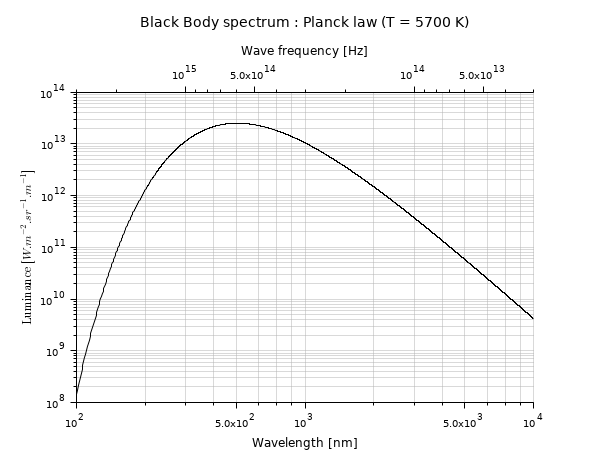
Light spectrum, versus both wavelengths and frequencies: two correlated logarithmic X scales.
function r=Planck(T, lambda)
    h = 6.626e-34;        // Planck constant    [J.s]
    c = 298792458;        // light speed [m/s]
    k = 1.381e-23;        // Boltzmann constant [J/K]
    // stef = 5.670374e-8 // Stefan constant [W/m2/K4]
    r = 2*h*c^2 ./ lambda.^5 ./ (exp(h*c./(lambda*k*T))-1);
endfunction

clf
lambda = (100:10000);
plot2d("ll", lambda, Planck(5700, lambda*1e-9)*1e-6)
xlabel("Wavelength [nm]", "fontsize",2)
ylabel("$\text{Luminance }[W.m^{-2}.sr^{-1}.µm^{-1}]$", "fontsize", 2)
xgrid(color("grey70")*[1 1],[1 1],[7 7])
a1 = gca();
a1.margins(3) = 0.20;
a1.sub_tics(2) = 8;

// 2nd axes, superimposed to the first one
a2 = newaxes();
a2.data_bounds = [3e13,0;3e15 ,1];
a2.Axes_reverse(1) = "on";
a2.axes_visible(1) = "on";
set(a2, "filled", "off", "log_flags","lnn", "x_location","top")
a2.tight_limits(1) = "on";
a2.margins(3) = 0.20;
xlabel("Wave frequency [Hz]", "fontsize",2)
title("Black Body spectrum : Planck law (T = 5700 K)", "fontsize",3)
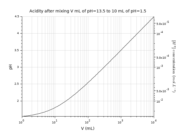
pH: A single curve, with two correlated Y scales: one linear, one logarithmic.
pH1 = 1.5;      // v1 = 10 mL of acid solution
pH2 = 12.5;     // v2 mL of basic solution
v2 = logspace(0,4,200);
// naive raw pH estimation after mixing
pH = -log10((10*(10.^-pH1) + v2*(10.^-pH2))./(10+v2));

clf
plot2d("ln",v2, pH)
ax1 = gca();
ax1.tight_limits(2) = "on";
ax1.sub_ticks(1) = 8;
xgrid(color("grey70")*[1 1],[1 1],[7 7])
title("Acidity after mixing V mL of pH=13.5 to 10 mL of pH=1.5", "fontsize",3)
xlabel("V (mL)", "fontsize",3)
ylabel("pH", "fontsize",3);

// [H^+] logarithmic 2nd scale
ax2 = newaxes();
ax2.data_bounds([4 3]) = 10.^(-ax1.data_bounds([3 4]));
set(ax2, "filled","off", "y_location","right", "log_flags","nln")
ax2.tight_limits(2) = "on";
ax2.axes_visible(2) = "on";
ax2.axes_reverse(2) = "on";
ylabel("$[H^+]\text{ concentration }(mol.L^{-1})$","fontsize",3)
ax2.y_label.font_angle = 90;
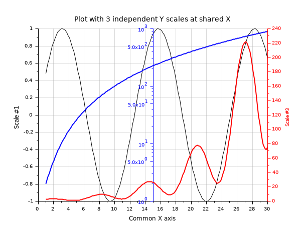
Three overplotted curves sharing the same X axis, with 3 independent Y scales:
// Preparing data
x  = linspace(1,30,200);
y2 = exp(x/6).*(sin(x)+1.5);
y3 = 1+x.^2;

clf

// Black curve => y1 scale (left axis)
y1 = sin(x/2);
plot2d(x, y1)
title(_("Plot with 3 independent Y scales at shared X"), "fontsize",3);
xlabel(_("Common X axis"), "fontsize",2);
ylabel(_("Scale #1"), "fontsize",2);
xgrid(color("grey70")*[1 1], [1 1], [7 7])

// Blue curve => y2 scale (middle axis)
c = color("blue");
ax2 = newaxes();
set(ax2, "filled", "off", "foreground", c, "font_color", c);
plot2d(x, y3, logflag="nl", style=c)
gce().children.thickness = 2;
ax2.axes_visible(1) = "off";
ax2.y_location = "middle";

// Red curve => y3 scale (right axis)
c = color("red");
ax3 = newaxes();
set(ax3, "filled", "off", "foreground", c, "font_color", c);
plot2d(x,y2,style=c);
ylabel(_("Scale #3"),"color",[1 0 0])
gce().children.thickness = 2;
ax3.axes_visible(1) = "off";
ax3.y_location = "right";
| Report an issue | ||
| << pie | Graphics | xchange >> |